Blog
GPT Image 2.5 up close: does a higher quality setting buy more detail?
We ran one watch through every GPT Image 2.5 quality setting and zoomed in. What low to max changes, what it costs, and what matters more.
GPT Image 2.5 has five quality settings, and the most expensive costs six times the cheapest. We wanted to know what that money actually buys, so we drew the same watch on every setting and zoomed in until the difference showed.
The short answer. Every setting drew the watch correctly, even the cheapest. The higher settings add fine surface texture, and you only see it when the product fills a big image. Inside a full ad, low and max looked the same.
What to use. High for a large product close-up. Low or medium for everything else. And before you pay for any setting, get a bigger product photo, because that changed the result more than the setting did.
The test: one watch, five settings
We picked a watch because a watch face is hard. It has thin hands, tiny printed words, and a brushed metal pattern that radiates from the centre. If a model is cutting corners, a watch face shows it.
We gave GPT Image 2.5 (the Sunburst version) Hamilton's own product photos of their Jazzmaster Quartz 32mm and asked for two images: a full ad, and a close-up of just the watch. We ran each on low, medium, high, x-high and max, twice each. That is 20 images at 2432 by 3344 pixels, for $5.26 in total.
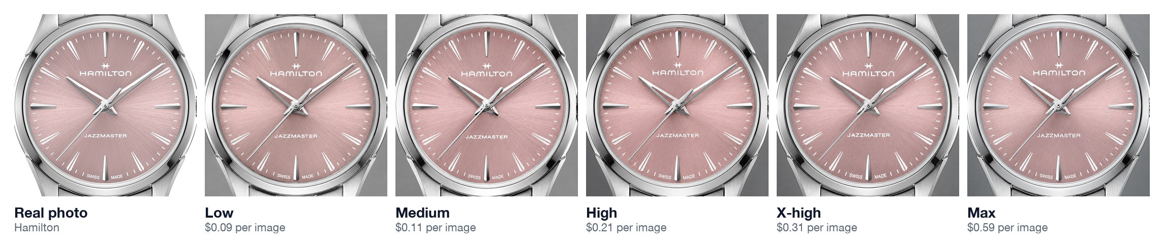
At normal viewing size, all five are right. The hands have the open centre the real watch has. The only words on the dial are the ones Hamilton prints there. There is no date window and no gold. The cheapest setting got every one of those details, which is the first thing worth knowing.
Zoom in and the settings split
The difference only appears when you look at a small patch of the dial at full resolution. Below is the same spot on each close-up: the edge of the minute hand, with the brushed pattern behind it.
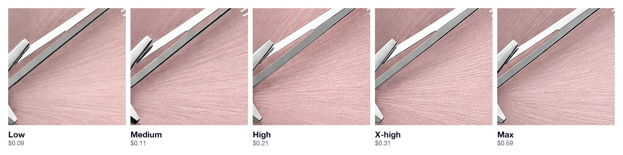
On low and medium the brushed lines look soft and slightly blotchy. From high upward they turn into fine, crisp strokes, which is what the real dial looks like. Past high, we could not see any further improvement.
We also measured it. We ran every crop through the same sharpness score, where higher means more fine detail. Low and medium averaged 71.5. High, x-high and max averaged 86.2.
That is a big gap, but it comes with a caution. We only ran each setting twice, and two runs of the same setting differed by as much as 12.6 points. So treat this as a strong lean that matches what your eye sees, not a settled number.
Inside a full ad, the difference disappears
A close-up that is almost all watch is the best case for the higher settings. Most ads are not that. The watch is one part of a scene, sharing the frame with a person, a background and some text.
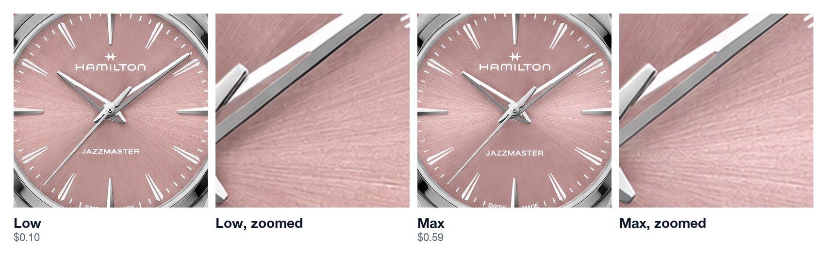
In the full ad, we could not find a difference. The sharpness scores agreed: 90.6 for low and medium, 89.5 for the top three. That gap is smaller than the gap between two runs of the same setting.
Our best guess is that detail needs pixels to show up in. When the watch covers a small part of the image, there is no room for the extra texture to appear. It could also be that the model spends its effort differently on a busy scene. Either way, for a full ad the extra money buys nothing you can see.
What each setting costs
On a given setting, every image cost the same to within a tenth of a cent, because the setting fixes how much the model draws. Here is the price and time for one full ad at this size.
Show as a table
| Setting | Cost per full ad | Cost per close-up | Time per full ad |
|---|---|---|---|
| Low | $0.0957 | $0.0948 | 34s |
| Medium | $0.1121 | $0.1112 | 38–40s |
| High | $0.2088 | $0.2078 | 49–50s |
| X-high | $0.3097 | $0.3088 | 63s |
| Max | $0.5918 | $0.5909 | 101–102s |
Max costs 6.2 times what low does and takes three times as long. About $0.08 of every image is the cost of sending the reference photos, which is why even low is not free. Prices are OpenAI's per-token rates from their API pricing page, applied to what each call actually used.
What matters more than the setting: the photo you give it
Before this test, we ran an earlier one with a single product photo from a retailer's shop. It was 850 pixels square, so the dial in it was only about 265 pixels wide.
No model got the hands right from that photo, even on high. The real hands are open in the middle, but at that size the opening barely shows, so neither we nor the models picked it up, and every model drew them solid. With Hamilton's own 2000-pixel photos, even the low setting drew them correctly.

So the order of spending is clear. Get the biggest, sharpest product photos you can, ideally from the brand itself. Only then decide whether a higher setting is worth it.
Sunburst, Flare, or GPT Image 2?
GPT Image 2.5 comes in two versions, Sunburst and Flare, at the same price. In that earlier test we also ran both against the older GPT Image 2, all on high, with the same brief.
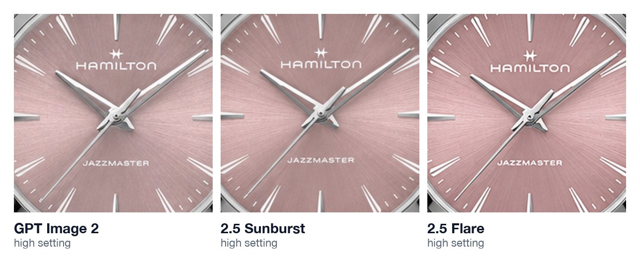
On the product, there was nothing between them: all 24 watch faces from that test came back right apart from the hands. The difference was in the rest of the ad. We asked each model to change the watch and leave everything else alone. Flare swapped the ad's brand logo in 3 of its 4 full ads, and tended to rewrite the ad copy as well. GPT Image 2 and Sunburst kept the original logo every time. That is why we use Sunburst.
Flaws no setting fixed
Two problems showed up regardless of what we paid. A small pink mark appeared on the wearer's hand, next to the watch, in 3 of the 10 full ads, on low and medium. And the close-up never made the watch fill the frame, even though we asked it to. Both are cheap to catch if someone looks at every image before it ships.
If you would rather not run these tests yourself, Wilow's Ad Studio makes ads from your own product photos, and the free Meta Ads Library shows what other brands in your space are running.
How we got the product right in the first place.
- We described every detail of the watch in the prompt, then listed the specific mistakes to avoid: no date window, no gold, no extra words on the dial.
- We sent the biggest product photos we could find, and said in the prompt what each one showed.
- We gave the model the exact words for every piece of text in the ad, so it had no reason to invent any.
All images were made with OpenAI's image generation API in September 2026. Watch images are cropped from test outputs and are not Hamilton advertising.


